E-commerce Design system, Product Grid ,Details Page based on Material UI
This case study explores the creation of a cohesive design system for LansingNow e-commerce platform, focusing on consistency and scalability across product grids and detail pages. The goal was to deliver a seamless shopping experience with on Brand engaging components and intuitive functionality, tailored to enhance user engagement and drive conversions.
Product Designer
4 Months
UX Research and Testing
Conversion Optimization
Design System
Prototyping
Developer Handoff
Challenge
The challenge was adapting the Material UI design system for e-commerce while also preparing a flexible design token system that follows the brand. The main point we had regarding UX is that people were abandoning their carts on Product Details page
Results
After addressing the Material UI inflexibilities, creating a robust variables library and creating the necessary components on most viewed pages, after implementation, the client had a sales increase and the highest recorded sale at once in Denver, USA!
Process
Evaluating pain points in an existing solution
Our first task was to analyze the the major pain points in the user Journey from landing to checkout, addressing any design inconsistencies in user flows.
We have found Significant brand inconsistencies across the board and unintuitive experience during Product specs selection
A design Audit was a good tool for this, where the annotated screens were shown to the product owner.
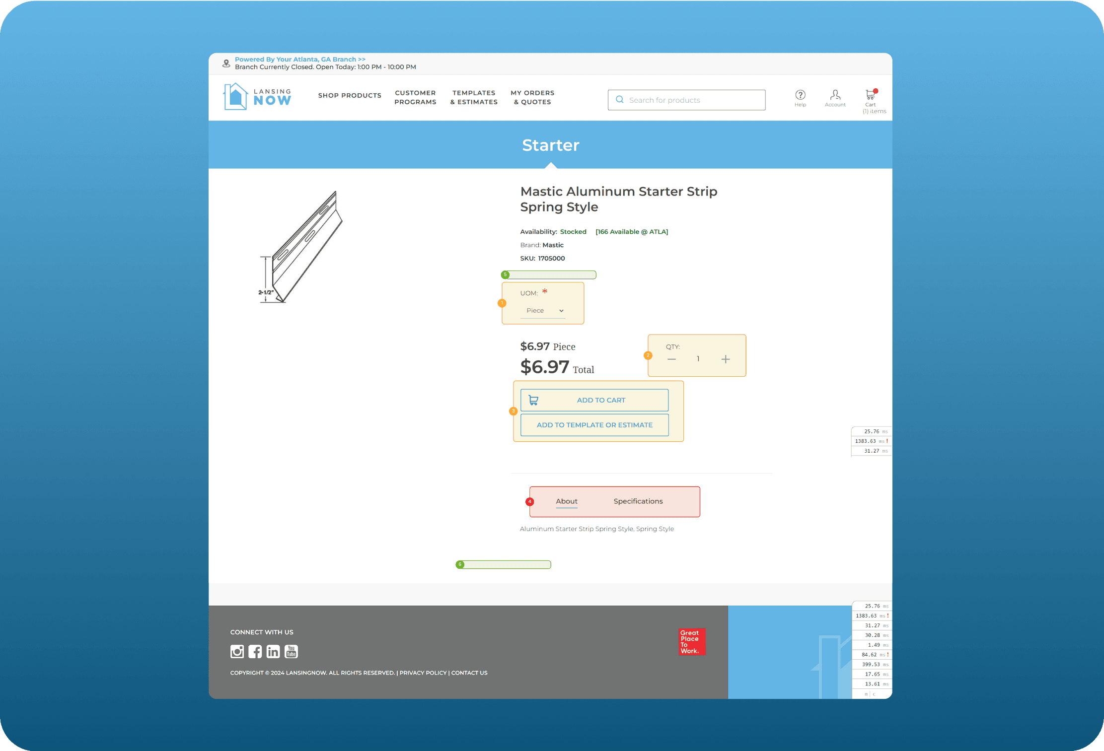
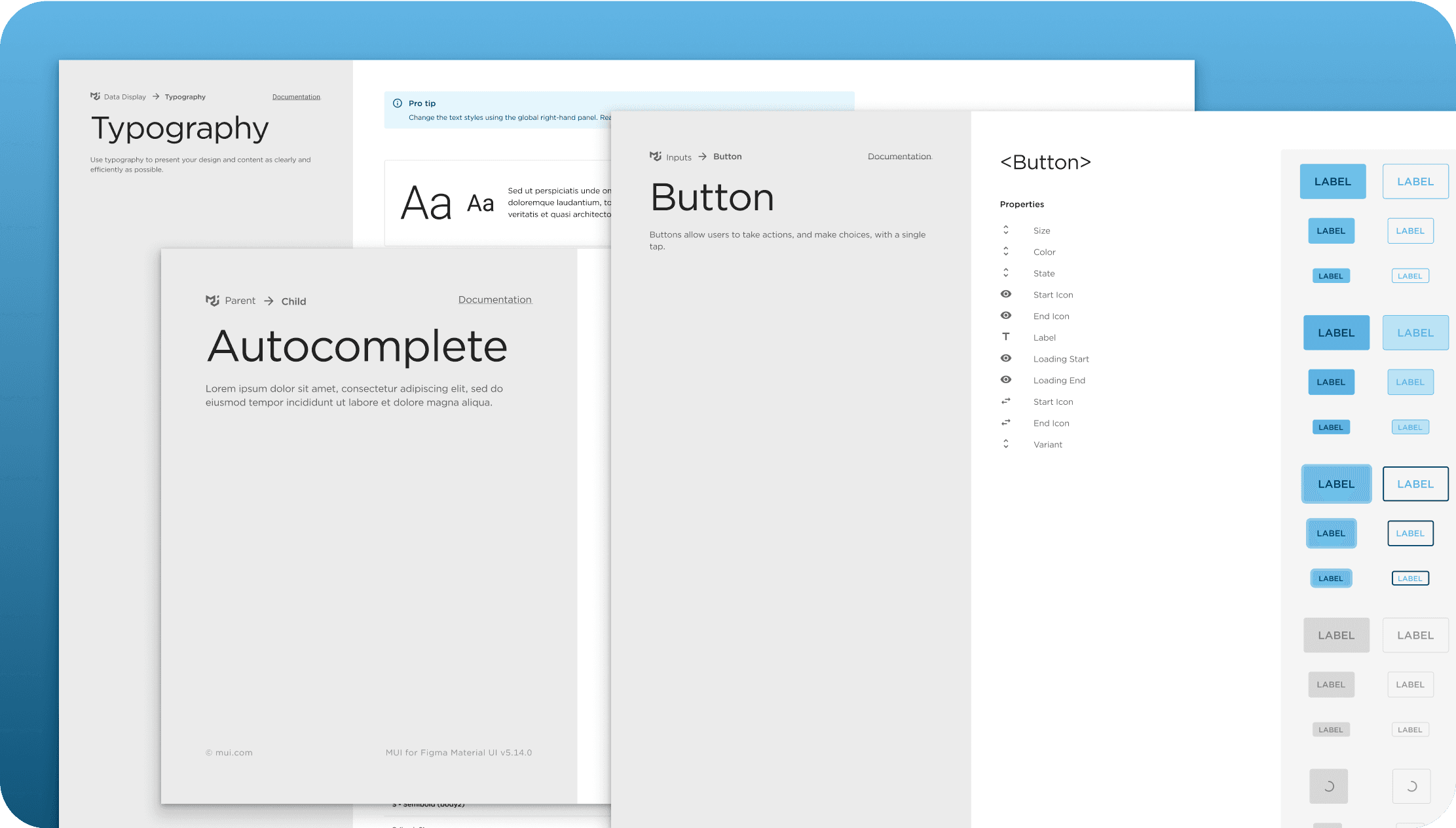
Material UI Design System conversion
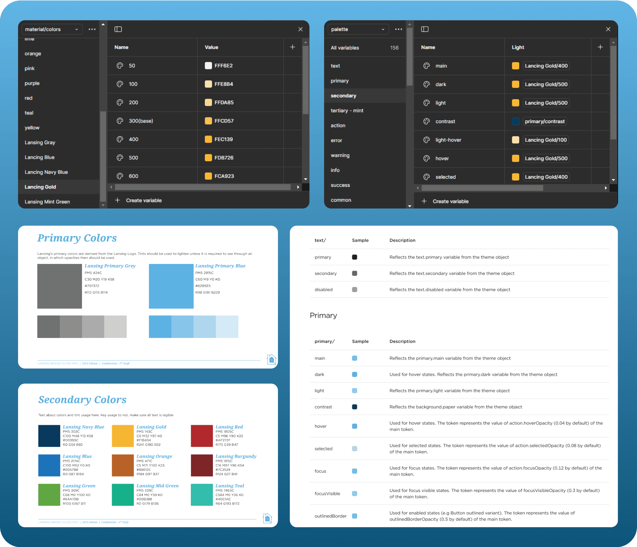
Since Material UI was in use before, in order to cut development time we have decided to modify the existing material ui design system to our needs, fitting in the Brand guidelines with the existing architecture of the design system.
We have used a mix of component and semantic based tokens, along with the primitives which Reflect brand guidelines
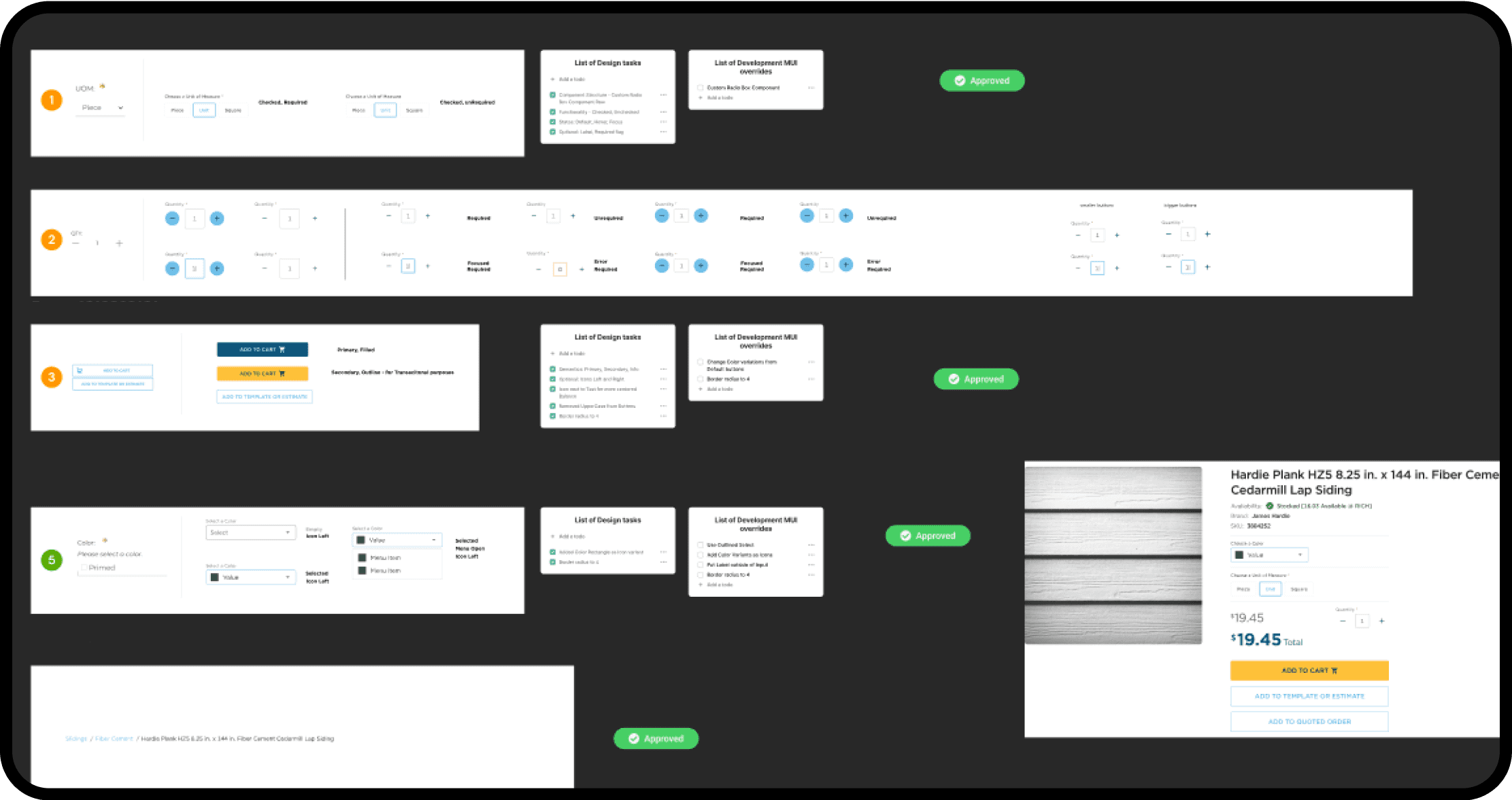
Custom Components Approval
For components which needed to be modified or brand new custom components, we had sessions with PO, PM and E-commerce experts to validate the design and see how these new components fit with the branding and engineering feasibility.
A basic tagging of approved/in-review/rejected was used, the finite list of components was documented in Jira Confluence
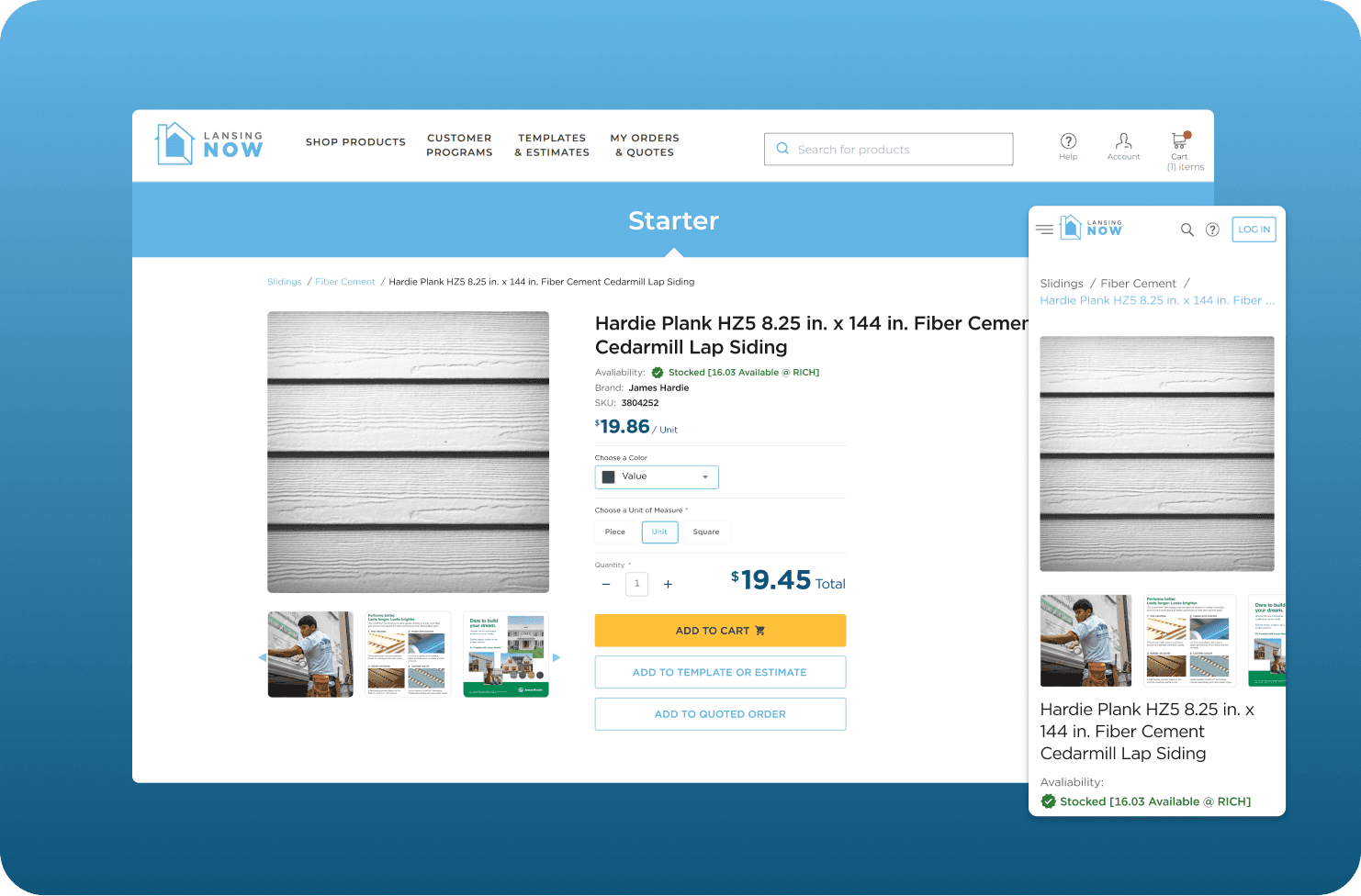
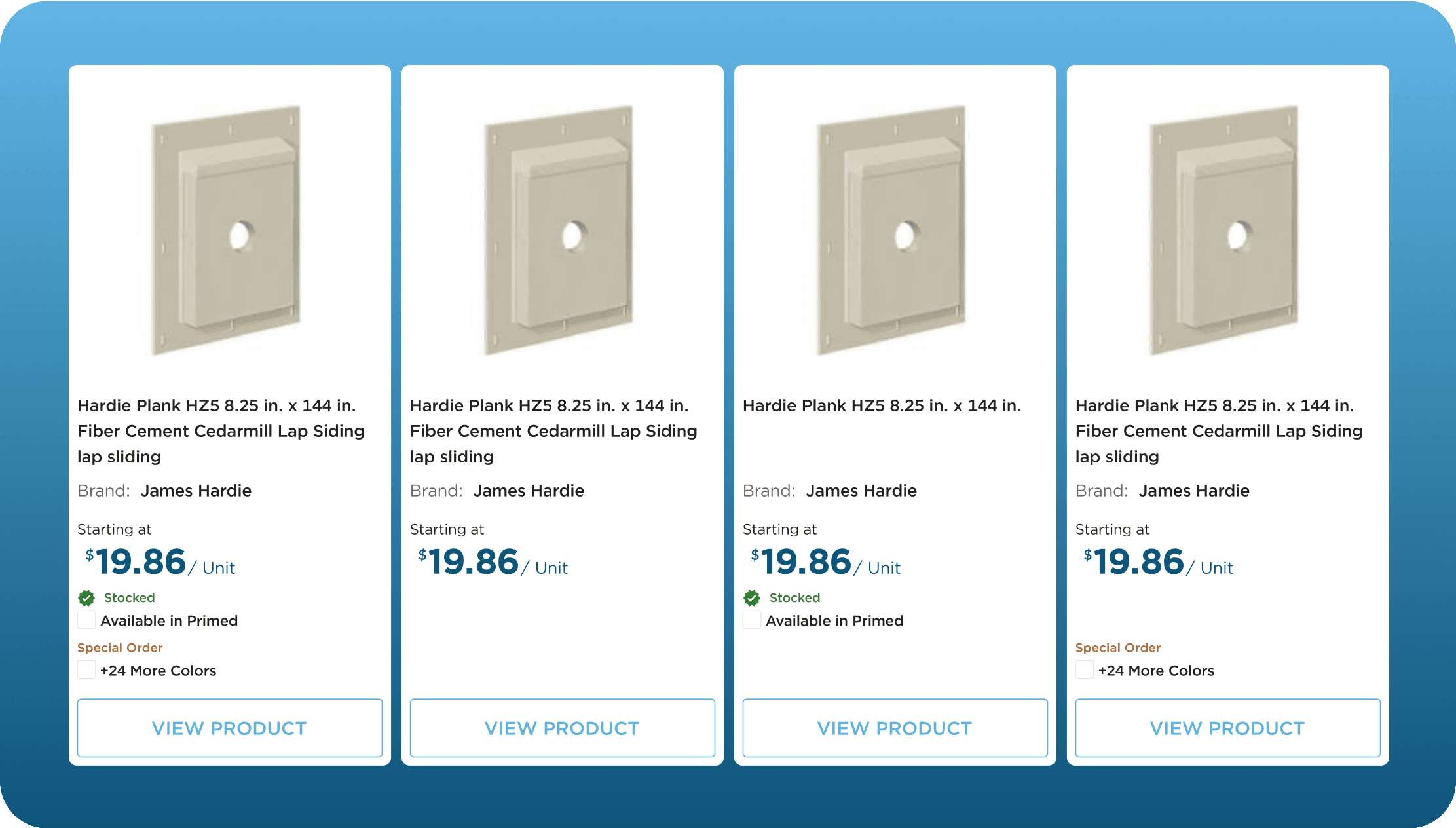
Optimizing Product Cards for Conversion
In Product Gallery it was important to redesign the cards to contain all the important information of the product but also arrange the information in a clear hierarchy
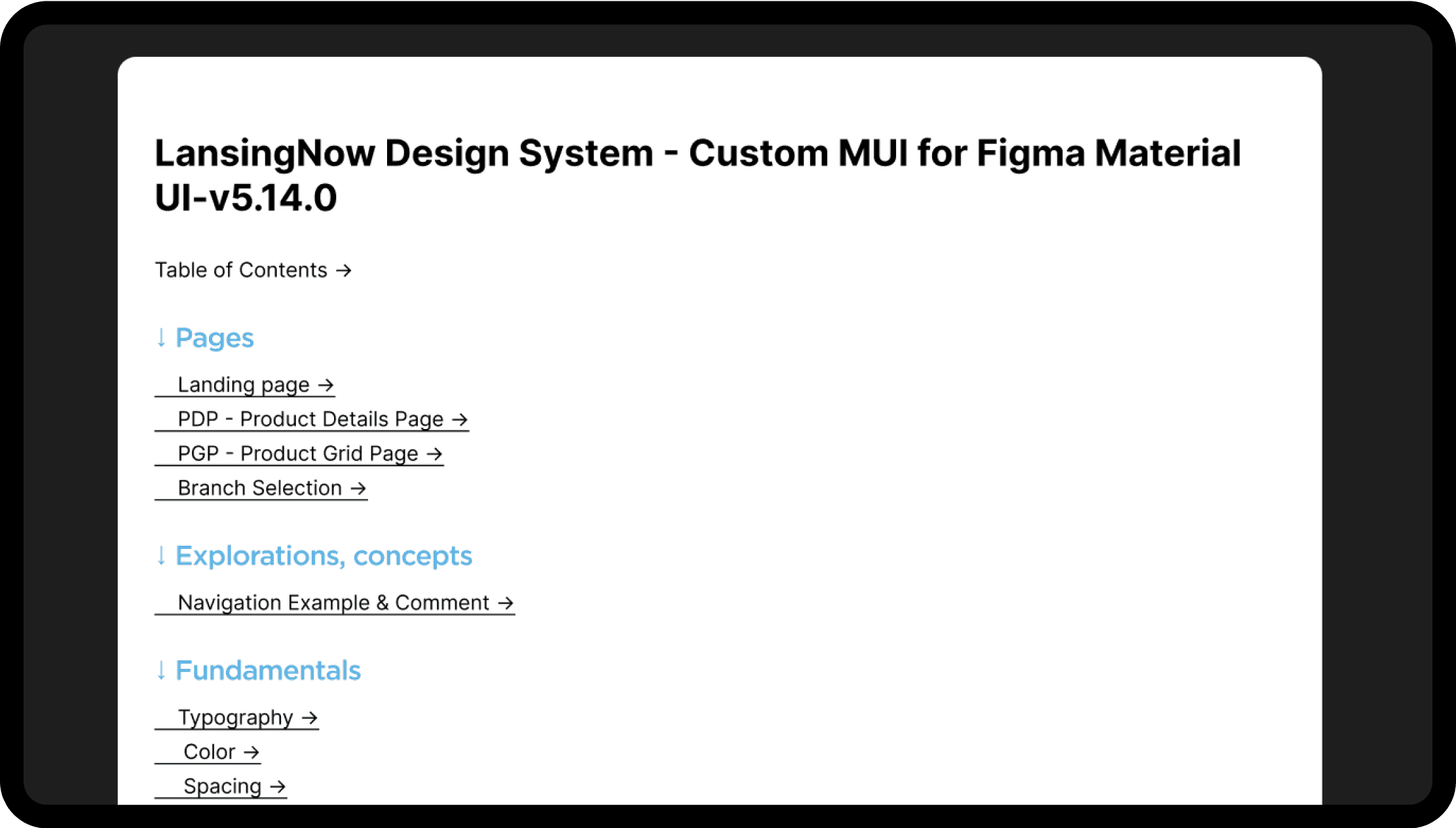
Design System Handoff
After all the component designs were approved, all necessary UX iterations were complete, we were tasked wih providing a documentation for our work for future scalability and development effort.
We have found Significant brand inconsistencies across the board and unintuitive experience during Product specs selection
Conclusion
As I mentioned, after our successful delivery, and a few months later after implementation, the client had a sales increase and the highest recorded sale bundle in Denver. This may have come from a lot of factors, but we pride ourselves for taking part in this success story.